TL;DR
TikTok safe zones are the parts of a 9:16 video that stay visible after TikTok adds captions, buttons, profile icons, and engagement controls. For 1080x1920 videos, keep key text away from the top 130px, bottom 484px, and right 140px. Blocked CTAs can drag down CTR, conversion rate, and ROAS because the viewer cannot read the offer. Manual templates work for low-volume teams. EzUGC is better when you need safe-zone-aware UGC ad variants in minutes instead of days.
TikTok Safe Zone Guide 2026: Stop Hiding Your CTAs Behind the UI
A lot of TikTok ads do not lose because the product is bad.
They lose because the discount code is under the caption, the CTA is behind the share button, and the hook text sits exactly where TikTok puts its interface.
That is a dumb way to burn spend.
For performance marketers, the TikTok safe zone is not a design nicety. It is the difference between a viewer seeing 50% off today and seeing half a sticker peeking out from behind the spinning record icon.
As of June 2026, the practical rule is simple: build 9:16 ads, keep your important text in the center, and preview before you launch. If you are producing one video a week, a template is fine. If you are testing 20+ UGC ads a week, use a workflow that bakes safe-zone placement into the creative process.
That is where EzUGC fits. Traditional UGC can cost around $200 per video once you hire creators and manage revisions. EzUGC lets DTC brands, agencies, and performance marketers create AI UGC ads for around $5 per video, with real-looking AI avatars, 29 publicly listed languages, and far fewer handoffs.
The point is not to make prettier TikToks. The point is to stop paying for ads people cannot read.
TL;DR: TikTok safe zones for ecommerce marketers
The core concept: The TikTok safe zone is the central area of a vertical 9:16 video, usually 1080x1920px, that remains visible after TikTok adds native UI elements like captions, profile photos, like buttons, share buttons, and the music ticker.
The practical strategy: Do not guess. Use safe-zone overlays, platform previews, and AI-assisted generation so hooks, product claims, discount codes, and CTAs stay where users can actually see them.
Key metrics to watch:
- Click-through rate: Target >1.5% by keeping CTAs unobstructed.
- Engagement rate: Target >4% by keeping the visual hook clear of UI clutter.
- Creative rejection rate: Target <1% by checking specs before upload.
Tools range from manual templates in Canva, Photoshop, or Premiere Pro to automated ad generation workflows like EzUGC and TikTok's own Creative Center.
What the TikTok safe zone actually means
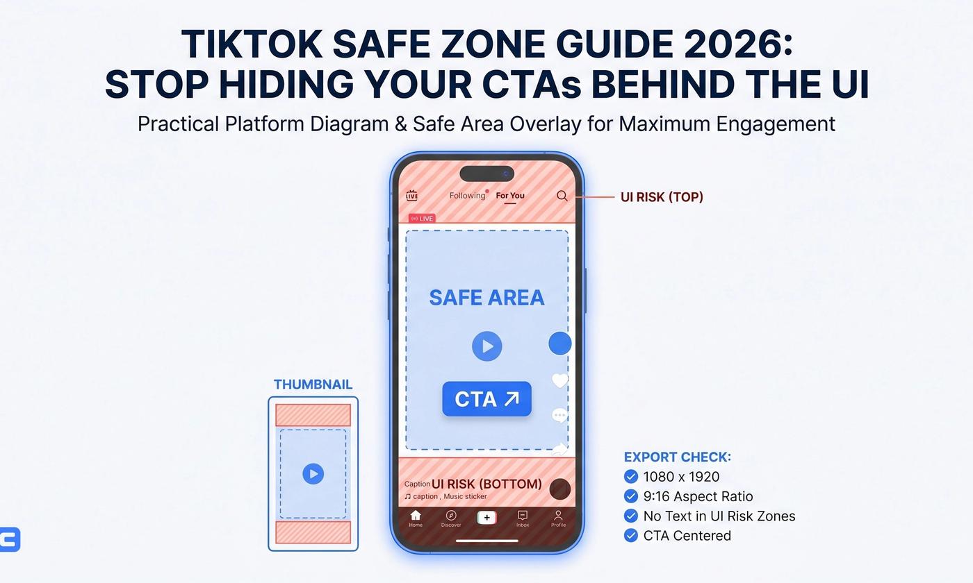
The TikTok safe zone is the part of your 1080x1920 vertical video where important content should sit so it does not get covered by TikTok's interface.
The app is not a blank canvas. It adds tabs at the top, captions and audio information at the bottom, and engagement buttons on the right. On some devices, these elements shift a little. Long captions can also eat more of the frame than short ones.
That matters more for ads than organic posts.
If your organic video has messy text, maybe people forgive it. If your ad hides the offer, you just paid for an impression that could not convert.
The source benchmark cited an analysis of 200+ ad accounts where ads with obstructed text elements saw a 30% lower conversion rate on average compared with optimized creatives. I would not treat that as a universal law, but the operating lesson is obvious: if the viewer cannot read the offer, your media buyer is fighting with one hand tied.
The main TikTok UI problem areas
TikTok's UI typically covers:
- Bottom 15-20% of the screen: captions, account name, music ticker, and CTA-style interface elements.
- Right 10-15% of the screen: profile photo, like, comment, share, and save actions.
- Top area: For You and Following tabs, search, and occasional interface changes.
So the job is simple: keep vital text, logos, product claims, and CTAs out of those zones.
A 9:16 video is still non-negotiable. Square 1:1 videos can technically run, but they look borrowed from another platform and waste the full-screen TikTok feed. For paid social, that is usually a bad trade.
The smarter safe-zone workflow

Most teams start with a static PNG overlay.
That is better than nothing. It is also how you end up with five Slack comments that say, move text up 80px, CTA still too low, and export again.
A stronger workflow has three parts.
1. Design around a center-safe grid
Start with a 1080x1920 canvas and divide it into a rough 3x3 grid.
Your hook text should live near the center or upper-middle. Product shots can fill the frame, but your claim, price, code, and CTA should not sit on the right rail or bottom strip.
Example:
- Bad: 50% OFF sticker in the bottom-right corner.
- Better: 50% OFF in the center-left or upper-middle section.
The second version survives TikTok's buttons. The first one gets mauled by the UI.
2. Add platform-specific buffers
TikTok does not render exactly the same across every phone, account, and placement. iOS and Android can look slightly different. Spark Ads and In-Feed ads can also have different visible elements.
That is why safe-zone work is not just about memorizing one diagram. You need margin.
Leave the bottom cleaner than feels necessary. Keep the right side boring. Put the money message where the thumb cannot cover it.
3. Validate before media spend
Preview the ad before launch.
Not after the campaign has spent $500. Not after CTR comes in ugly. Before.
Manual teams can use overlays in Premiere Pro, Canva, Figma, Photoshop, or CapCut. Performance teams that need more creative volume can use EzUGC to produce UGC-style video ads with more consistent layout rules across variants.
The hidden cost is not the one bad export. It is the revision loop.
Exact TikTok safe zone dimensions and specs for 2026
For most TikTok ad production in 2026, use a 9:16 vertical video at 1080 x 1920 pixels.
That is the baseline.
Standard aspect ratio
The gold standard is:
- Aspect ratio: 9:16
- Resolution: 1080 x 1920 pixels
- Use case: In-Feed ads, Spark Ads, organic-style paid creative
Square 1:1 can work in some placements, but I would not start there for TikTok. It leaves too much screen unused and feels less native.
Safe area for text and key elements
For a standard 1080x1920 video, keep important creative elements away from these zones:
- Top margin: Leave at least 130px clear from the top to avoid the For You and Following tabs and search area.
- Bottom margin: Leave at least 484px clear from the bottom. This is the danger zone for captions, music, account name, and interface overlays.
- Right margin: Leave 140px clear from the right edge to avoid the profile photo, like, comment, and share stack.
- Left margin: Keep 44px clear to avoid edge cropping across device sizes.
These are production-safe numbers, not sacred geometry. TikTok can change UI treatments, and placements can vary. But if your ad follows these margins, it is much less likely to hide the thing you paid to show.
UI elements that commonly block TikTok ads
The usual offenders:
- Caption: Can expand upward, especially when the caption is long.
- Music ticker: Runs across the lower area.
- Engagement buttons: The right-side vertical stack is where text goes to die.
- Profile and follow elements: These can cover product details if you place them too close to the right edge.
A simple test: take a screenshot of your ad in preview mode and squint. If the offer does not read instantly, it is too fragile.
Why blocked elements kill ROAS
Blocked text is not an aesthetic problem.
It is a cash problem.
Imagine paying for a billboard and letting a tree cover the phone number. That is what happens when your Shop Now, 20% off, or bundle deal sits under TikTok's caption.
The source article reported that moving CTA buttons out of UI clutter helped some DTC brands drop CPA by 15-20%. Again, do not turn that into a guaranteed forecast. But it is a very believable pattern because the mechanism is simple: clearer ad, faster comprehension, better click behavior.
CTR drops when the next action is hidden
If the CTA is covered, the viewer has to infer what to do.
Most will not. They will swipe.
For TikTok ads, a CTR below 1% is often a sign to inspect the opening frame, the offer, and the CTA position. Safe zones will not fix a weak product or a boring hook, but they remove one obvious failure point.
Engagement suffers when the hook is fighting the interface
TikTok gives you roughly the first couple seconds to earn attention.
If your first text overlay is half under the top tabs or tangled with the right-side buttons, the hook has to work harder than it should. The algorithm reads fast exits as a quality signal. Your CPMs can get uglier from there.
Conversion rate gets punished by confusion
High clicks and low conversions usually point to offer mismatch, landing page issues, or bad targeting.
Low clicks can be simpler: people did not see enough reason to click.
Safe-zone placement is one of the cheapest audits you can run. It costs nothing to move a CTA 200px up before export. It costs real money to find out later.
Manual vs automated TikTok safe zone optimization
You can do this manually. Plenty of good teams do.
But there is a line where manual checking stops being craft and starts being drag.
| Task | Traditional Way (Manual) | The AI Way (EzUGC) | Time Saved |
|---|---|---|---|
| Safe Zone Check | Overlaying a PNG in Premiere Pro for every edit | Auto-generated within safe boundaries | ~15 mins/video |
| Resizing | Manually cropping 16:9 to 9:16 | Instant AI reframing | ~10 mins/video |
| Text Placement | Dragging text layers and guessing | AI places text in high-vis zones | ~5 mins/video |
| Variation Testing | Editing 1 video at a time | Generating 50+ compliant variants | ~5 hours/week |
When manual templates are enough
Manual templates work when:
- You publish a small number of ads each week.
- Your editor already uses a reliable overlay.
- Your videos have minimal on-screen text.
- You are making high-touch cinematic edits where every motion graphic needs human judgment.
For one or two ads, do not overcomplicate it. Add the overlay. Preview the final. Ship.
When AI generation makes more sense
The math changes when your account needs volume.
A performance team testing 20+ creatives a week cannot afford a safe-zone debate on every export. They need a repeatable production system: script, avatar or creator, layout, captions, variants, review, launch.
EzUGC is built for that kind of workflow. It creates UGC-style video ads in minutes, using AI avatars that look real, with 29 publicly listed languages for teams running across markets. The cost structure is different too: around $5/video instead of the roughly $200/video traditional UGC can cost when you hire creators one by one.
That does not mean you stop reviewing ads. It means your review is about the hook, claim, and offer - not whether the CTA is hiding under the caption again.
Case study: Bloom Beauty and the cost of creative fatigue
The source article included a case study about Bloom Beauty, a cosmetics brand with a winning Texture Shot ad.
The problem was familiar: the concept worked, then fatigue hit. The team needed new versions without making cheap copies or accidentally blocking text with TikTok's UI.
The problem
Bloom Beauty had one ad style that pulled attention.
But paid social does not let you live off one winner forever. Frequency climbs. CTR softens. CPA creeps up. Then everyone starts asking for more variants by Friday.
The bottleneck was not only creative ideas. It was producing variations that still looked on-brand and stayed compliant.
The solution
The source described an AI-assisted workflow where Bloom cloned the structure of the winning ad and rewrote the script in its own Scientific-Glam voice.
That is the right way to think about creative iteration. Do not copy the ad like a photocopier. Keep the working bones: opening shot, proof point, product texture, CTA rhythm. Then change the script, avatar, angle, offer, and visual order.
In an EzUGC workflow, that could mean generating multiple UGC-style versions of the same winning concept:
- One creator leading with a texture demo.
- One leading with a problem-solution hook.
- One leading with a discount or bundle.
- One localized into another supported language.
- One with the CTA moved higher and cleaner for TikTok.
The results
The case study reported:
- CTR: Achieved a 3.1% CTR.
- Performance: Beat the control ad by 45%.
- Compliance: Zero ads were rejected for text obstruction.
The bigger lesson is not that every cosmetics brand should expect a 3.1% CTR.
The lesson is that creative volume and layout discipline belong in the same system. If you scale variants without safe-zone rules, you scale mistakes too.
The safe-zone KPIs worth tracking
You do not need a 40-column dashboard for this.
Start with four numbers.
1. Click-through rate
CTR tells you whether the ad created enough interest to move someone off the feed.
If CTR is below 1%, inspect the hook and CTA placement before blaming the audience. Is the first claim readable? Is the CTA visible? Is the offer sitting above the bottom UI?
A safe-zone fix will not rescue a dull angle, but it can remove friction from an already decent ad.
2. ThruPlay or video view rate
If viewers drop in the first three seconds, look at the first frame.
A lot of teams bury the hook under a beautiful product shot and then put tiny text near the bottom. TikTok is not a landing page. The hook needs to read fast, even with UI overlays.
3. Conversion rate
Conversion rate tells you whether clicks are turning into buyers.
If CTR is high and CVR is low, the problem may be the landing page, offer, or promise mismatch. If CTR is low and the text is blocked, you have a visibility issue before you have a funnel issue.
4. Creative refresh rate
Top brands refresh creative weekly because fatigue is real.
The question is whether your team can launch new ads without turning every safe-zone check into a production meeting. EzUGC helps here by making UGC ad variants faster and more consistent, especially for agencies and DTC brands running many paid-social tests at once.
A 30-day TikTok safe zone implementation plan

This is not glamorous work.
It is the kind of operational cleanup that quietly saves money.
Week 1: Audit your last 10 ads
Pull the last 10 TikTok ads you launched.
Watch them on a phone, not just inside an editor. Mark every instance where the hook, offer, discount code, logo, subtitle, or CTA is blocked.
Then create a red Do Not Cross layer in your editing files. Put the bottom, right, and top danger zones in every template.
Week 2: Build a faster variant workflow
Take your best-performing ad and create 5-10 variations.
Change one meaningful thing at a time: hook, opening visual, avatar, script angle, CTA, or offer framing. If you use EzUGC, generate UGC-style variants and compare the speed against manual editing.
Launch a simple split test:
- Manual control.
- AI-generated variant.
- Same offer, cleaner safe-zone layout.
Do not make the test so fancy that you cannot read it.
Week 3: Stress test production volume
Try to launch 20 new creatives in one week.
That number sounds high if your team is stuck in manual creator sourcing. It sounds normal if you are using AI UGC for first-pass testing.
Monitor:
- Rejection rate.
- CTR.
- First-three-second hold.
- CPA.
- Whether ads exit learning cleanly.
Also check whether every text overlay stays inside the central safe area of the 1080x1920 canvas.
Week 4: Standardize what worked
Compare compliant and non-compliant ads.
Look for CTR and CPA differences. Review which hooks survived the feed. Save the layouts that kept text visible without making the ad look like a PowerPoint slide.
Then turn the workflow into a monthly habit:
- Pick winners.
- Generate variants.
- Keep the safe-zone rules.
- Launch.
- Kill weak ads fast.
- Feed the next round with what worked.
That is the loop.
Key takeaways
- The TikTok safe zone is the visible part of a 1080x1920px vertical video that avoids TikTok's UI overlays.
- As a practical 2026 baseline, leave 130px clear at the top, 484px at the bottom, 140px on the right, and 44px on the left.
- Blocked CTAs and text overlays can hurt CTR, CVR, and ROAS because viewers cannot read the offer.
- Manual templates are fine for low-volume teams, but they get slow when you need many ad variants.
- EzUGC helps performance teams create AI UGC ads in minutes, at roughly $5/video, compared with about $200/video for traditional UGC creator production.
- Always preview final ads before launch, especially if you are reusing creative across TikTok, Reels, and Shorts.
Create TikTok ads that people can actually read

Safe zones are not the sexy part of creative strategy.
They are just where the money leaks.
If you are still hiring creators one by one, waiting days for revisions, and manually checking every CTA against a TikTok overlay, you are moving too slowly for paid social.
EzUGC helps DTC brands, agencies, and performance marketers create realistic AI UGC video ads in minutes, with consistent formatting, fast variants, and support for 29 publicly listed languages.
Build the ad. Keep the CTA visible. Test the next angle.
Sources and citations
- TikTok video ad specifications · TikTok Business Help Center
Primary platform reference for TikTok video ad format and creative requirements.
- TikTok Creative Center · TikTok for Business
Useful for reviewing current TikTok ad creative patterns and platform-native examples.
- YouTube Shorts ad format context · Google Ads Help
Helpful context for vertical video placements when adapting TikTok creatives to Shorts.
Frequently asked questions
Direct answers pulled into the page to improve answer-first relevance and scanability.