TL;DR
The best charity ads do not just make people sad. They give donors a specific action, a visible outcome, and a reason to act now. Use fear for urgent crisis appeals and hope for retention-heavy monthly giving. Measure Cost Per Donor, Donation Conversion Rate, LTV, and creative fatigue - not likes. Modern nonprofit creative needs weekly testing, modular video assets, and clear landing-page continuity. EzUGC can help teams create more UGC-style ad variants quickly, especially when traditional creator production at roughly $200/video is too slow or expensive.
Why most charity ads fail to convert
The brutal thing about charity ads is that most of them get the first half right.
They make someone feel something.
Then they lose the donation.
The pattern from 200+ nonprofit ad accounts is ugly: 70% of budget is wasted on awareness campaigns that generate zero tangible action. Commercial brands figured out direct response years ago. A lot of charities are still asking for passive empathy and hoping the checkout page handles the rest.
It usually does not.
The best charity ads in 2026 do three things fast: they stop the scroll, make the need specific, and give the donor a clear job. Not save the world. Fund one meal. Buy one mosquito net. Get one truck to one flooded town.
That is the gap between a sad video and a donor acquisition machine.
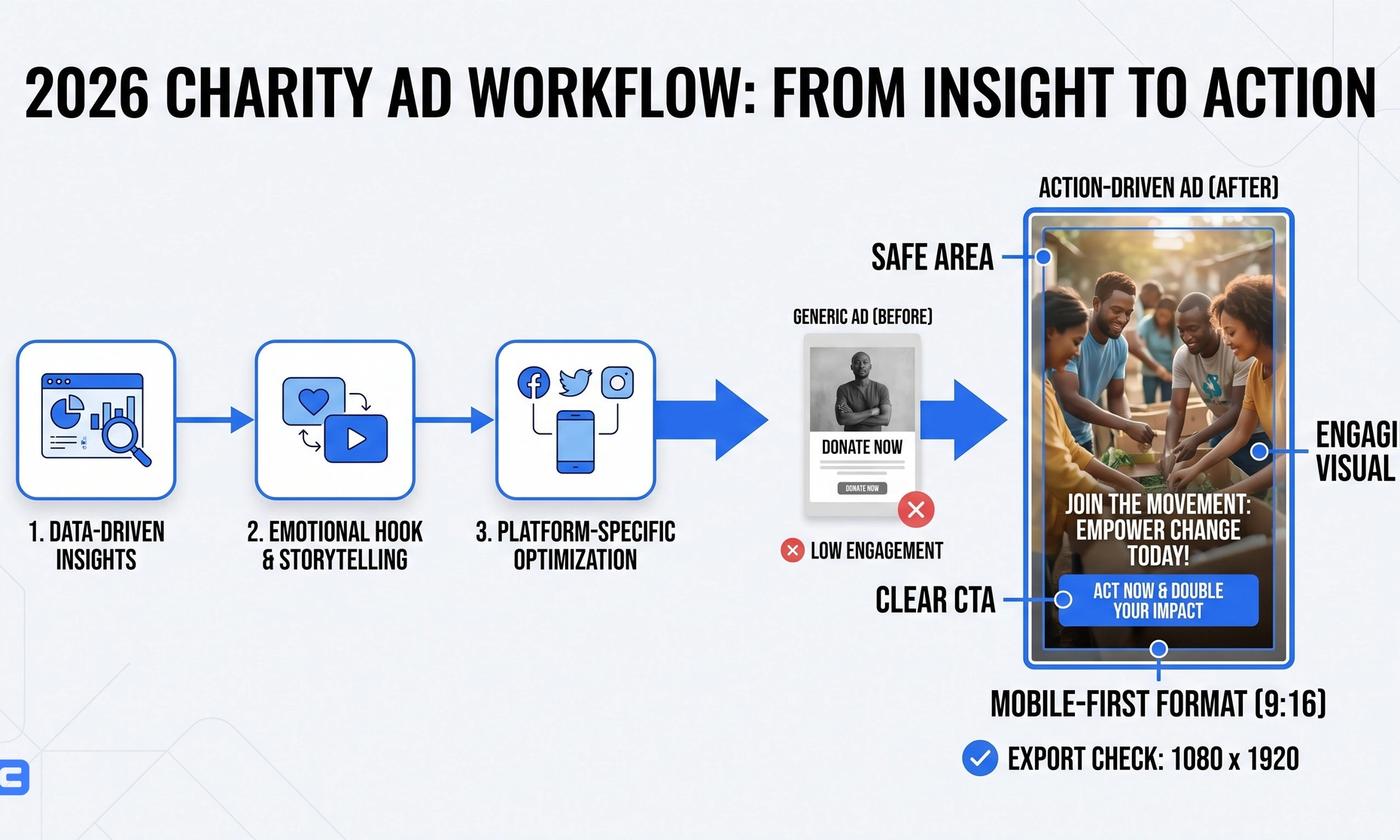
The charity ad model that still works: hook, empathy, action
Modern charity advertising has moved away from pure shock tactics. Good. Poverty porn burns out donors and makes your organization look lazy.
The better model is Hook - Empathy - Action.
- Hook: Win attention in the first 3 seconds.
- Empathy: Connect the viewer's values to one human story.
- Action: Give them a specific, low-friction way to intervene.
This is basically Direct Response Television thinking, rebuilt for TikTok, Meta, YouTube Shorts, and email retargeting. The channel changed. The psychology did not.
A strong charity ad does not say: support our mission.
It says: $10 funds clean water for one family this week.
That is a different machine.
Hope vs. fear in charity advertising
Charity ads run on two emotional fuels: fear and hope.
Fear is the emergency brake. Hope is the engine.
Fear works when the threat is immediate: a child needs food today, a storm hit last night, medical supplies are stuck at the border. It triggers urgency, but it also creates fatigue fast.
Hope works when the goal is retention. It makes the donor feel like an investor in progress, not a bystander being guilted into a one-time payment.
| Feature | Fear-Based Strategy | Hope-Based Strategy | Best Application |
|---|---|---|---|
| Primary Emotion | Guilt, Urgency, Anxiety | Pride, Connection, Optimism | Emergency Relief vs. Long-term Development |
| Donor Retention | Low (One-off gifts) | High (Monthly recurring) | Crisis Appeals vs. Child Sponsorship |
| Creative Fatigue | Very High (Burnout) | Low (Brand building) | Short-term blitz vs. Always-on |
| Avg. Conversion | High immediate conversion | Slower conversion velocity | Immediate cash flow vs. LTV growth |
The mistake is treating these as moral categories. They are not.
They are tools.
Use fear when delay creates harm. Use hope when you need a donor to still care six months from now.
Emotional resonance in DRTV and digital charity ads
Emotional resonance is not just making someone sad.
It is the alignment between a viewer's values and the story in the ad, creating tension that can only be resolved by a specific action. Donate. Sponsor. Text. Share. Start a monthly gift.
That last part matters.
A video can make someone cry and still produce a terrible Cost Per Donor. The ad has to validate the viewer's identity as a helper, then point that identity at a measurable action.
As of 2026, this matters more because budgets are not exactly exploding. Gartner reported that marketing budgets have flatlined at around 7% of revenue [1]. When budget is tight, emotional guessing gets expensive.
You need testing, not taste.
20+ charity ad examples broken down by strategy
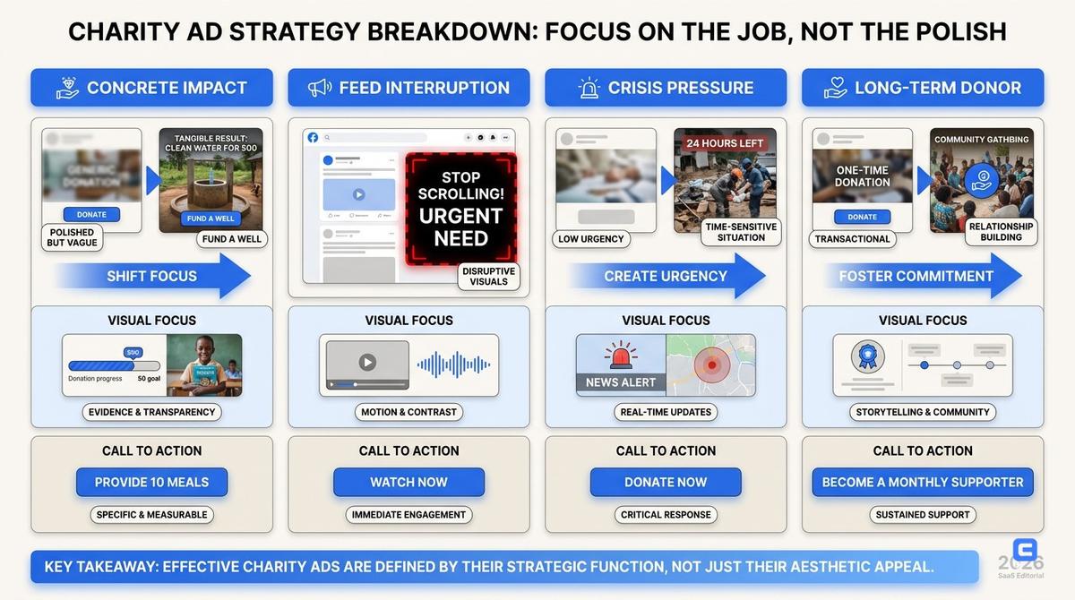
Do not study charity ads by how polished they look.
Study them by the job they do.
Some ads make the impact concrete. Some interrupt the feed. Some use crisis pressure. Some build a long-term donor identity. The best nonprofit creative team knows which lever it is pulling before the first frame is edited.
Concrete impact ads
These ads answer the donor's real question: where does my money go?
That question is not cynical. It is practical.
WaterAid - The Girl Who Can't Wait
The hook: One girl's daily walk for water.
Why it worked: It uses the identifiable victim effect. Donors respond better to one named person than to a statistic about millions.
Fast version to test: A split-screen video: her morning versus your morning. One side shows a tap, school bag, coffee. The other shows a water container, a long walk, and missed class.
Charity: Water - The Spring
The hook: Monthly giving framed as a community, not a guilt payment.
Why it worked: It sold the solution. Clean water, drilling rigs, visible progress. Not endless images of disease.
Fast version to test: An animated UGC-style explainer showing how one monthly subscription funds a specific piece of the water project.
Kiva - Loans That Change Lives
The hook: You are not donating. You are lending.
Why it worked: It removes the feeling of loss. The donor becomes a backer of agency, not a rescuer.
Fast version to test: Borrower-style selfie videos saying thank you to the lender by name. This is where UGC structure matters: direct eye contact, plain language, no narrator voice trying to sound profound.
No Kid Hungry - meal-specific giving
The hook: A gift turns into a meal, not a vague campaign.
Why it works: Hunger is huge. A meal is graspable.
Fast version to test: A 15-second ad that opens with an empty lunch tray, then overlays the exact donor action and result.
Habitat for Humanity - home as outcome
The hook: A family opening the door to a finished home.
Why it works: The transformation is visual. Before, during, after. You do not need a four-minute manifesto.
Fast version to test: Three shots: foundation, volunteer hands, family at the door. CTA: fund materials, not help families thrive.
St. Jude - treatment without family billing
The hook: The family burden is removed.
Why it works: Medical charity ads often get abstract. St. Jude makes the donor's role operational: support treatment, travel, housing, and food so families can focus on the child.
Fast version to test: Parent-facing testimonial with one concrete line about what the gift covers.
Pattern interrupt ads
Social feeds are built to numb people.
A pattern interrupt breaks the thumb's rhythm before the brain decides to escape.
Movember - Unspoken Rules
The hook: Men sitting in silence.
Why it worked: It made the discomfort the point. No swelling piano. No over-explaining.
Fast version to test: A 6-second bumper with a close-up of a mustache and the line: ask him how he really is.
Save the Children - Second a Day
The hook: A normal Western girl's life collapses into war, one second at a time.
Why it worked: It moved a distant crisis into a familiar domestic setting. That bridges the empathy gap fast.
Fast version to test: A vertical short showing a normal school day interrupted by crisis alerts, evacuation, and silence.
Barnardo's - Believe in Me
The hook: Raw, gritty visuals paired with defiant hope.
Why it worked: It rejected the passive victim frame. The child has potential. The donor is asked to bet on it.
Fast version to test: Black-and-white portraits with bold text: I am not a statistic.
ALS Ice Bucket Challenge
The hook: A public challenge with social pressure built in.
Why it worked: It turned donation into participation. The creative format was easy to copy, which is why it spread.
Fast version to test: A donor nomination format where every participant names the action, not just the campaign.
WWF Earth Hour
The hook: Turn off the lights.
Why it worked: The action was symbolic, visible, and social. People could show they participated.
Fast version to test: Before-and-after city visuals, then a simple pledge CTA.
Amnesty International - rights violations in familiar settings
The hook: A human-rights issue placed inside a viewer's normal environment.
Why it works: It makes distant injustice feel local without pretending the situations are identical.
Fast version to test: A phone-lock-screen creative where rights are stripped away one notification at a time.
Urgency and crisis ads
Urgency is useful when it is honest.
It gets gross when every campaign is treated like a burning building.
UNICEF - Yemen Crisis
The hook: Direct eye contact from a malnourished child.
Why it worked: Gaze cueing stops attention. When the subject looks at the camera, the viewer feels addressed.
Fast version to test: Instagram Story creative with a countdown overlay: 24 hours to get supplies to this region.
British Red Cross - The Power of Kindness
The hook: CCTV-style footage of people helping during disasters.
Why it worked: Social proof. It says helping is what people like us do.
Fast version to test: A carousel tied to recent local disasters with a Donate Local button.
Doctors Without Borders - emergency medical access
The hook: Medical teams entering places most viewers cannot.
Why it works: It gives the donor a practical role: fund the people already on the ground.
Fast version to test: Field-worker UGC explaining what one emergency kit does, filmed in one take.
Feeding America - local food bank pressure
The hook: Empty shelves in a food bank.
Why it works: It connects a national problem to local inventory. Empty shelves are more concrete than food insecurity.
Fast version to test: A volunteer-facing vertical video: this shelf feeds 40 families. It is empty by Thursday.
International Rescue Committee - crisis displacement
The hook: A family leaving with only what they can carry.
Why it works: It compresses the crisis into one decision: what would you take if you had 10 minutes?
Fast version to test: Object-based creative showing a passport, child's shoe, medicine, and phone battery.
Hope and identity ads
Hope ads make the donor feel like they joined something durable.
This is where monthly giving usually lives.
Make-A-Wish - wish fulfillment
The hook: A child gets a day that illness does not control.
Why it works: The outcome is emotionally clear. The ad does not need to explain the whole organization.
Fast version to test: Wish reveal footage cut with a donor-facing line: you helped make this day possible.
The Trevor Project - crisis support for LGBTQ youth
The hook: A young person reaches someone who answers.
Why it works: The value is immediate and human. The donor funds the person on the other end of the line.
Fast version to test: Text-message style creative showing the moment help arrives.
Crisis Text Line - anonymous support
The hook: A phone screen at 2:13 a.m.
Why it works: It understands the use case. Crisis support often starts privately, not in a dramatic public scene.
Fast version to test: Screen-recording style ad showing the first message and the response.
American Cancer Society - survivorship stories
The hook: A survivor talking about a birthday they almost missed.
Why it works: It makes research, screening, and support visible through one lived milestone.
Fast version to test: UGC testimonial from a survivor using one date, one doctor visit, one outcome.
World Central Kitchen - meals after disaster
The hook: Hot food arriving before the bureaucracy feels real.
Why it works: The impact is immediate and visual. A plate of food beats a paragraph about emergency response.
Fast version to test: Field footage of meals being packed, handed off, and eaten in under 20 seconds.
How to measure charity ad effectiveness
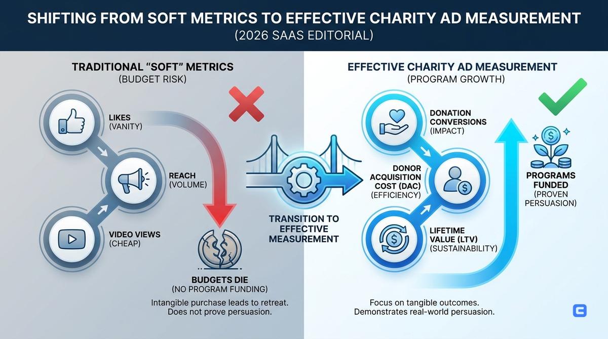
The purchase is intangible, so nonprofit teams often retreat to soft metrics.
That is how budgets die.
Likes do not fund programs. Reach does not prove persuasion. Video views can be bought cheaply and still produce no donor pipeline.
Track the numbers that tell you whether the ad moved money, not mood.
Donation Conversion Rate
Donation Conversion Rate is the percentage of visitors who complete a donation.
Average benchmarks hover around 1-2% for cold traffic. If you are below 0.5%, your landing page, offer, or donation flow is probably disconnected from the ad.
The usual culprit: the video is human and emotional, then the landing page looks like a tax form from 2009.
Cost Per Donor
Cost Per Donor is your CPA.
It varies wildly by cause, season, and gift type. For monthly giving, a CPD of <$50 is often sustainable if LTV is >$200.
Do not judge a campaign only by first donation amount. A $20 monthly donor can be worth far more than a $75 one-time gift if retention is strong.
Creative Refresh Rate
Creative fatigue is not a theory. It is math with a thumbnail.
Campaigns that refresh creative every 7-10 days see a 40% lower CPA over time compared with teams running the same assets for a month.
That does not mean you need a new shoot every week. It means you need new hooks, first frames, CTAs, captions, avatars, testimonial angles, and edit sequences.
Thumb-Stop Ratio
For video, measure how many people watch the first 3 seconds.
If the thumb-stop ratio is under 20%, the hook is failing. The rest of the ad could be brilliant. Almost nobody is getting there.
This is why the first shot matters more than the mission statement.
The scale-first production method for nonprofit ads
The old model was simple: spend $50,000 on one hero TV spot, cut it into a few versions, and hope it lasts all quarter.
That model is too slow for paid social.
Modern charity creative needs a scale-first system: lots of modular assets, tested weekly, rebuilt from the pieces that win.
| Feature | Traditional Agency Model | Scale-First Methodology |
|---|---|---|
| Asset Volume | 1 Hero Video + 3 Cutdowns | 50+ Variations / Month |
| Testing Cycle | Monthly or Quarterly | Weekly Sprints |
| Format | Horizontal (TV First) | Vertical (Mobile First) |
| Cost Structure | High Fixed Costs | Variable / Tech-Enabled |
Start with five narrative angles
Do not script one ad.
Script five angles.
- The urgency angle
- The specific impact angle
- The donor identity angle
- The beneficiary story angle
- The local relevance angle
Same cause. Different psychological entry points.
One viewer responds to the emergency. Another responds to the monthly progress. A third wants to know exactly where the $10 goes.
Build modular assets, not locked films
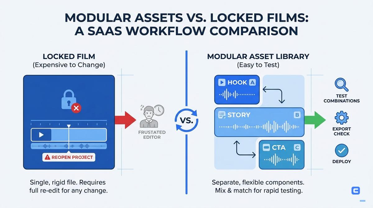
A locked film is expensive to change.
A modular asset library lets you test Hook A with Story B and CTA C without begging an editor to reopen the whole project.
Keep these pieces separate:
- First-frame hooks
- Field footage
- Beneficiary clips
- Donor testimonials
- Statistical overlays
- CTA endings
- Landing-page matching copy
This is also where AI UGC can help. Traditional UGC creator production can cost around $200/video and take days. EzUGC can create AI UGC-style video ads for around $5/video, with more consistency and faster variant testing.
For nonprofits and agencies, the real win is not replacing every human story. It is testing more hooks before you spend your best footage.
Assemble for weekly testing
The goal is not to make 50 random videos.
The goal is to learn which angle lowers Cost Per Donor.
A simple weekly sprint might test:
- Three opening hooks
- Two donor CTAs
- Two emotional frames, fear versus hope
- Two landing-page headlines
- One monthly giving ask versus one one-time gift ask
If your organization works across regions, language also matters. EzUGC publicly supports 29 languages, which makes it useful for donor appeals, localized UGC-style explainers, and agency workflows where translating one English ad into multiple market versions would normally create another production bottleneck.
Common charity ad mistakes that kill donations
Most charity ad failures are not creative failures.
They are coordination failures.
The ad says one thing. The donation page says another. The CTA is vague. The first three seconds are slow. The beneficiary has no agency. The donor is asked to feel everything and do nothing specific.
The poverty porn trap
Over-indexing on suffering can cause avoidance.
If viewers feel helpless, they scroll away to protect themselves. That is not because they are bad people. It is because the ad gave them pain without agency.
The fix: show the solution path.
Do not define a person only by their suffering. Show resilience, choice, dignity, and the practical role the donor plays.
The vague impact problem
Help us save the world is too big.
Help us buy one net for one child is concrete.
In the source analysis, changing copy from support our mission to fund this specific truck increased conversion rates by nearly 15%.
That is the whole lesson. Specific beats noble.
The broken landing-page handoff
A charity ad can be emotionally perfect and still fail if the landing page breaks the spell.
If the ad is about a child's school day, the landing page should not open with a generic organization description. If the ad asks for emergency aid, the first screen should not make users dig through six donation categories.
Match the emotional temperature.
Use the same story, the same impact claim, and a fast payment option like Apple Pay or Google Pay.
The single-channel dependency problem
Meta still matters. TV still matters for some donor segments. TikTok and YouTube Shorts matter for younger audiences and retargeting pools.
But relying on one platform is fragile.
A practical split is 60/40: put 60% of spend into your core converting channel and 40% into emerging or secondary video platforms. That gives you room to learn without starving what already works.
Key takeaways for nonprofit marketers
- Move from awareness to action. If 70% of your budget is going to passive awareness with no donation path, you are buying expensive applause.
- Use fear carefully. It is strong for crisis appeals, weak for donor retention.
- Build hope into monthly giving. Hope makes donors feel like partners in progress.
- Get concrete. One net, one meal, one truck, one call answered.
- Refresh creative every 7-10 days. Static ads get expensive fast.
- Track Cost Per Donor and LTV. Reach is not a business model.
- Match the landing page to the ad. The donation flow should feel like the next step, not a new conversation.
- Produce modularly. Hooks, stories, CTAs, and formats should be swappable.
Turn charity ad ideas into testable video variants
Understanding charity ad psychology is step one.
Producing enough ad variants to find what works is step two.
That is where most teams stall. They know they need more hooks, more languages, more UGC-style creatives, more donor CTAs. Then production turns into a two-week revision loop.
EzUGC is built for that gap. DTC brands, agencies, and performance marketers use it to create AI UGC video ads in minutes, with realistic avatars, consistent output, and public support for 29 languages.
For charity teams, the workflow is simple: write the donor angle, generate the video, test the hook, keep the winner, and move on.
If your next campaign needs 20 variants instead of one polished guess, start with EzUGC: https://app.ezugc.ai
Sources and citations
- 2025 CMO Spend Survey · Gartner
Referenced for the finding that marketing budgets have flatlined at around 7% of overall company revenue.
- Marketing budgets flat as AI and data drive efficiency · MarTech Edge
Referenced for budget-pressure context around marketing efficiency.
Frequently asked questions
Direct answers pulled into the page to improve answer-first relevance and scanability.