TL;DR
Exact Instagram safe zones for Stories, Reels, and grid previews in 2026. Use pixel guides, avoid UI crops, and build safe-zone-ready ads in EzUGC.
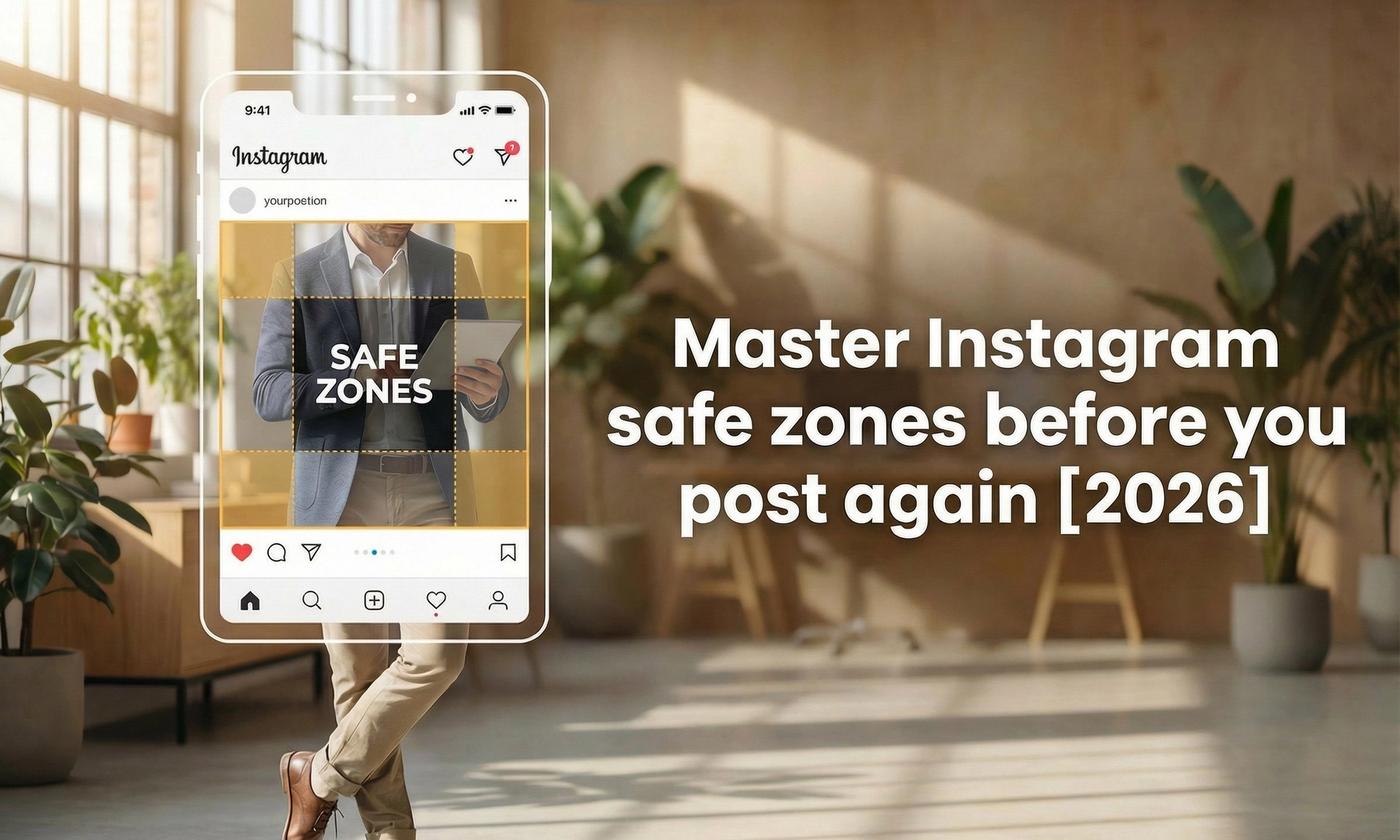
Instagram safe zones are the “protected” areas of a Story, Reel, or feed asset where your text, logo, subtitles, and CTA stay visible across phone sizes, UI overlays, and profile grid previews.
They’re invisible. They’re boring. They’re also the difference between:
- a clean, intentional creative that looks like it was designed for Instagram
- and a “why is my headline half missing” post that screams amateur
This guide gives you the exact canvases, the practical safe-zone rules designers actually follow, and the performance signals that move when you frame correctly. Then we’ll translate it into an EzUGC workflow so your ads ship safe-zone compliant by default.

Instagram safe zones: exact sizes and ratios
According to HubSpot’s 2025 Social Media Image Size Guide, the core canvases still hold: 1080×1920 (9:16) for Stories and Reels, 1080×1350 (4:5) for portrait feed posts, 1080×1440 (3:4) for grid-aligned designs, and 1080×1080 (1:1) for square content. These ratios look similar at first glance but behave differently once Instagram’s UI overlays and previews come into play.
Instagram still rewards creators who respect the canvas. The platform will happily compress, crop, and overlay UI on top of your “perfect” design. Your job is to design for the version people actually see.
The core canvases (start here every time)
- Stories + Reels: 1080 × 1920 (9:16)
- Portrait feed posts: 1080 × 1350 (4:5)
- Grid-forward designs (thumbnail-first): 1080 × 1440 (3:4)
- Square posts: 1080 × 1080 (1:1)
If you do nothing else, memorize those four.
The title-safe rule (the one rule you can enforce everywhere)
Keep your critical elements inside the central 70-80% of the frame:
- Leave the top 10-15% free for usernames and UI
- Leave the bottom 10-15% free for captions, reply bars, and buttons
If you prefer a simple pixel guide on a 1080 × 1920 canvas:
- Treat the center as your “safe” working area and leave ~250-300 px clear at the top and bottom as a practical buffer.
- If your creative relies heavily on lower-thirds (subtitles, prices, CTAs), give the bottom extra breathing room.
Instagram’s overlays shift slightly across devices and UI updates, so think in buffers, not absolutes.

Canvas & aspect ratios: 9:16, 4:5, 3:4 - when to use each
9:16 (Stories + Reels)
Use this for:
- Reels
- Stories
- Mobile-first ads
- Anything where motion and full-screen immersion matter
This is where safe zones matter most, because UI overlays are the most aggressive.
4:5 (Feed domination without grid pain)
Use this for:
- Feed posts when you want maximum screen real estate
- Static ads that need room for product, proof, and a CTA
- Carousels where the first slide is doing the heavy lifting
4:5 is the “biggest” feed format without feeling like a Reel.
3:4 (Grid-first design)
The classic square grid is giving way to taller previews. The Verge reports that Instagram’s new 3:4 layout is reshaping how Reels covers and feed posts display inside your profile. It’s subtle, but it changes how every frame should be composed.
Use this for:
- Covers and thumbnails that must look clean on your profile
- Brands that care about a consistent grid aesthetic
- Posts where the thumbnail is the acquisition layer
If the grid is your storefront, 3:4 is your shelf spacing.
1:1 (Square)
Use this when:
- You’re repurposing content across platforms
- Your subject is centered and product-centric
- Consistency matters more than maximal height
It’s not dead. It’s just not the default anymore.
Title-safe vs action-safe: spacing that survives UI changes
Think in two layers:
Title-safe
Where your “meaning” lives:
- Main headline
- Product name
- Face framing
- Logo
- Price
- Primary CTA
Action-safe
An inner buffer for anything interactive or persistent:
- Captions and subtitles
- Stickers
- “Tap here” prompts
- Lower-third CTAs that stay on screen
A good habit: design your layout so it still reads if the UI steals another 5-10% tomorrow.
Export & compression checklist (so your text doesn’t turn to mush)
For 1080p Instagram delivery:
- Container: MP4
- Video codec: H.264
- Audio codec: AAC
- Bitrate: typically 10-20 Mbps for crisp 1080p exports
- Frame rate: match your source footage (often 24-30 fps)
Avoid:
- thin fonts on moving backgrounds
- text hugging edges
- heavy filters that create noisy halos around letters
- decorative borders that get clipped and look “broken”
Final test: preview your video in a phone-like view with UI overlays enabled in your editor if available.
Instagram Story safe zones: protect text from interface
Stories look simple until you overlay:
- username + profile elements at the top
- reply field and action buttons at the bottom
- stickers, link buttons, and interactive UI layers that shift
A practical Story layout that rarely fails
On 1080 × 1920:
- Keep your hook and headline in the upper-middle
- Keep subtitles and secondary text in the middle
- Keep CTAs above the bottom UI zone, not sitting on it
If you want a clean “rule of thumb” buffer:
- leave ~250-300 px clear at the top
- leave ~300-350 px clear at the bottom (bottom UI tends to be heavier)
Make stickers follow your story, not block it
Treat stickers like supporting actors:
- place them after your hook is understood
- keep them away from edges
- avoid covering faces, products, or key text
A simple placement hierarchy:
- Hook (top-center)
- Proof / benefit (center)
- Sticker or link (lower-center, still safe)
Typography that survives motion + compression
Stories move fast and compress hard. Give your text a fighting chance:
- use bold or semi-bold weights
- add a subtle stroke or soft shadow
- keep lines short (long lines blur faster)
- keep spacing comfortable (tight lines look messy in motion)
Accessibility basics that also boost retention:
- readable font size (don’t design like it’s a desktop)
- strong contrast between text and background
- avoid placing text over high-frequency patterns (grass, hair, glitter, grain)
The “heat zone” principle
Stories still dominate short-form engagement, and instagram story safe zones decide whether your message actually lands. In 2025, Instagram remains one of the most-used platforms among U.S. teens and young adults. Pew Research confirms it’s still a daily habit for more than half of them. That reach makes every pixel count, especially when the app’s interface hides more than it shows.
The central third is where attention naturally lands first.
Put your face, product, and primary line there. Everything else supports it.
Instagram Reel safe zones: captions, hooks, and pacing for longer videos
Reels are where safe zones quietly decide performance because persistent UI + captions + buttons compete with your lower-thirds.
Where Reels usually fail
- headlines too close to the top and clipped by UI
- subtitles too low and blocked by captions/buttons
- CTAs placed exactly where the interface lives
A safe Reel layout that scales
On 1080 × 1920:
- Hook text sits in the upper-safe area
- Subtitles sit in the mid-lower safe area, not at the edge
- Brand mark stays small and consistent, away from corners
- End card is centered and clean
Subtitle best practices that look expensive:
- 1-2 lines max
- avoid thin fonts
- increase letter spacing slightly if the font is cramped
- keep the subtitle block inside your safe area, even during motion
Start strong: hook design in the first two seconds
The first seconds are a framing test:
- is your hook fully visible?
- is the subject centered?
- does the UI block anything important?
If your headline gets clipped, the Reel feels broken before the viewer even decides if they care.
Close with an end screen that’s tappable
Give yourself a clean 2-3 seconds where nothing competes:
- centered CTA
- simple line of value
- strong contrast
- large tap targets (design for thumbs, not mice)
3:4 grid previews: design covers and posts that won’t crop
Your profile grid is a conversion layer now. People decide if you’re worth tapping based on tiny previews.
Here’s the key idea:
The grid-friendly crop inside a 9:16 Reel
If your Reel is 1080 × 1920, a 3:4 “grid window” is effectively:
- 1080 × 1440 centered inside the frame
That means:
- anything important that sits above or below that center window is at risk of looking awkward on your profile grid
- faces and text that are “perfect” in full-screen can feel chopped as a thumbnail
How to design a Reel cover that looks intentional
- design your cover on 1080 × 1920
- visualize (or guide) the centered 1080 × 1440 window
- keep the subject and the headline inside that grid window
- keep text minimal (thumbnails don’t reward paragraphs)
A simple feed hedge that works
If you care about grid aesthetics and feed performance:
- Slide 1: 3:4 hero image (grid clean)
- Slide 2+: 4:5 versions (feed dominance)
This keeps your storefront tidy while still maximizing in-feed real estate.
Measure safe-zone impact: the KPIs that actually move
Safe zones are not just “design hygiene.” They show up in metrics fast.
Track these:
- 3-second view rate / hook retention
- average watch time
- completion rate
- Story tap-through rate (links, replies, sticker taps)
- saves and shares (creative resonance signals)
What it looks like when safe zones are wrong:
- sharp drop in the first 1-3 seconds
- comments like “can’t read this” or no comments at all because people never saw the CTA
- lower saves because the “value” text got hidden
Run a simple 2×2 test
Create four variants:
- tight margins + captions
- tight margins - no captions
- safe margins + captions
- safe margins - no captions
Then compare:
- hook retention
- watch time
- CTR / tap-through
Even small framing fixes often show up as meaningful lifts because you’re removing friction, not chasing novelty.
Safe-zone templates you can standardize across your team
If you want consistency, systemize it.
Template A: Reels caption layout
- Hook: upper-safe
- Subtitles: mid-lower safe
- Logo: small, upper corner but inside buffer
- CTA: end screen only (centered)
Template B: Story promo layout
- Headline: upper-middle
- Proof: center
- Offer: center-lower
- Sticker/link: lower-middle, not bottom edge
Template C: Grid-first cover
- Subject centered
- One short headline
- Everything inside the 3:4 center window
How to use EzUGC to stay safe-zone compliant (without thinking about it every time)
Safe zones fail when your workflow is chaotic:
- scripts written last minute
- subtitles added after export
- logo slapped in a corner
- CTA shoved into the bottom because “it looked empty”
EzUGC fixes this by making safe-zone compliance a default behavior, not a last-minute rescue.
What you need
- Your product page, product images, or a media folder
- A clear goal (clicks, purchases, leads, installs)
- 10-20 minutes for the first version, then rapid variants
A practical EzUGC workflow
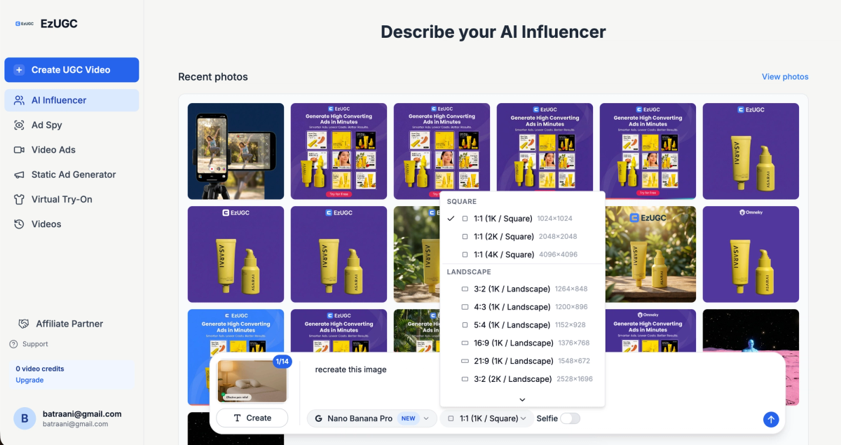
1) Start with format-first setup
Pick your output format up front:
- Reels/Stories (9:16, 1080 × 1920)
- Feed portrait (4:5, 1080 × 1350)
- Grid-first cover (3:4, 1080 × 1440)
This prevents “designed for YouTube, posted on Instagram” syndrome.
2) Generate your script around the safe zone, not against it
Write the hook as one short line that can sit comfortably in the upper-safe area.
Good hooks are:
- readable at thumbnail size
- strong without needing small text
- visually supported by the subject
Then map:
- proof line (center)
- benefit (center)
- CTA (end card)
3) Build subtitles that remain readable after compression
In EzUGC, treat subtitles as a design element:
- keep them inside the mid-lower safe band
- two lines max
- bold weight
- consistent placement across variants
Subtitles that jump around look cheap. Subtitles that stay stable look like a brand.
4) Design the end card like it’s the product
End screens are where conversion happens.
Make it simple:
- one CTA
- one reason
- one visual anchor (logo or product)
Keep it centered and clean so UI doesn’t compete.
5) Export variants like a performance team
Don’t ship one creative. Ship a set:
- Hook A/B
- Subtitle style A/B
- End card CTA A/B
- Background footage A/B
The goal is not perfection. The goal is fast learning with clean framing.
6) Pre-flight checklist before you post
- Are hook and subject inside the title-safe area?
- Are subtitles clear and not touching the bottom UI zone?
- Does the cover look clean inside the 3:4 grid window?
- Does the CTA appear on an uncluttered end screen?
- Can you understand the video with audio off?
If you can pass this in 30 seconds, you’re operating like a pro.
Final takeaway
Safe zones sound like a design detail. In practice, they’re a distribution detail.
They protect the one thing Instagram punishes fastest: confusion.
- If your hook is clipped, people swipe.
- If your subtitles are hidden, people drop.
- If your cover looks cropped, people don’t tap.
Frame for the real viewing experience, build repeatable templates, and let EzUGC handle the boring constraints so you can spend your taste on the creative that wins.
Sources and citations
- Ultimate Guide Social Media Image Dimensions Infographic · blog.hubspot.com
- 10 Facts About Teens And Social Media · pewresearch.org
- Instagram Help Center · Instagram
Official product guidance and feature documentation.